Time to continue this mini-series about travel posters which began with Argentina & moved on to Spain. Now let’s take a look at Portugal… one of my favorite places that was very popular in the mid-20th century, then fell off tourists’ radar until about 2010. The secret is out again: Portugal rocks!
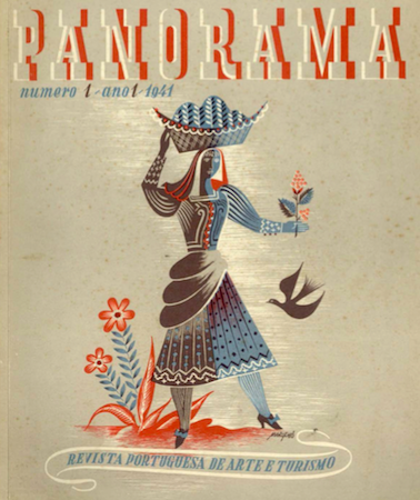
As with next-door neighbor Spain, encouraging tourism after World War II sought to create revenue for Portugal based on its natural & cultural features: sun, sand, an extensive coastline & long-maintained folk traditions. Created in 1933 under the Estado Novo, the Secretariado Nacional de Informação, Cultura Popular e Turismo (SNI for short) hoped to attract new visitors with the magazine “Panorama”. First published in 1941, this art & tourism journal filled its pages with photos by Artur Pastor, Eduardo Portugal & many others. “Panorama” also covered museums, new infrastructure projects to help tourists explore the country & even praised the rural sector. All part of Salazar’s master plan.
Although the magazine can be considered first & foremost as propaganda for the Estado Novo, it also became a venue for showcasing new artists… most of which would be responsible for the images we still envision when dreaming of Portugal today. Nuno Costa even predicted the current tourism boom:
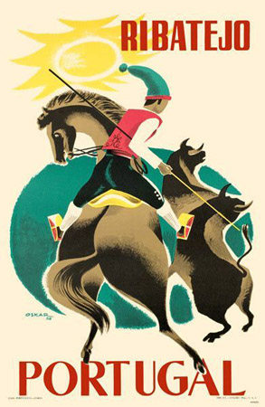
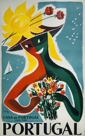
Oskar —real name Óscar Pinto Lobo— was born in Goa in 1913 & worked for the SNI in the 1950s & 1960s, producing several iconic posters. He was even the father of Ana Salazar, one of the most recognized fashion designers for Portugal in the 20th century. Easy to see that talent ran in her family:
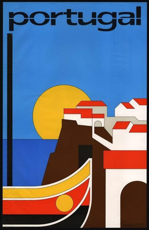
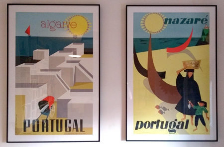
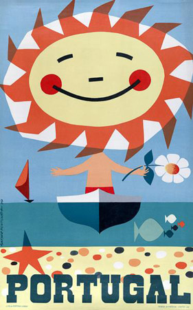
My favorite poster artist of them all is Gustavo Fontoura. I even have two of his 1956 originals hanging in my living room! All the stereotypical topics are there, but I love his use of color & simple shapes. 5,000 prints were made of each poster… maybe I can find remaining copies of the others eventually:
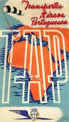
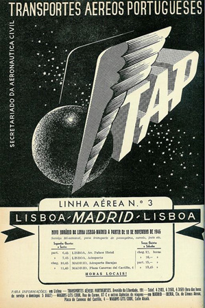
The national airline, Transportes Aéreos Portugueses (TAP), had very few European routes because they chiefly focused on keeping Portugal connected with their colonies. But I found a futuristic advertisement for the Lisboa-Madrid service in “Panorama”:
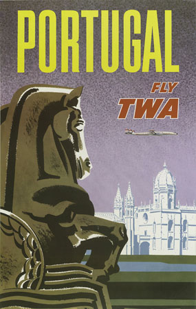
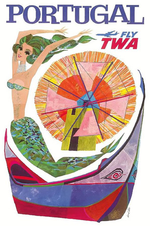
A few US companies offered flights to Portugal in the 1950s. TWA’s master artist David Kline used the Mosteiro dos Jerónimos + a mermaid, windmill & boat from Nazaré to entice travellers:
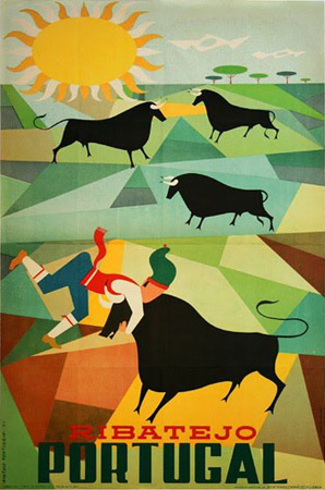
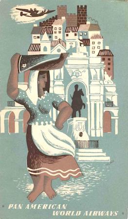
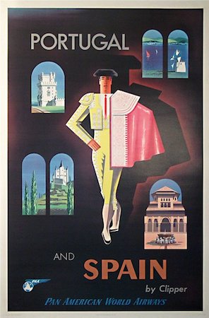
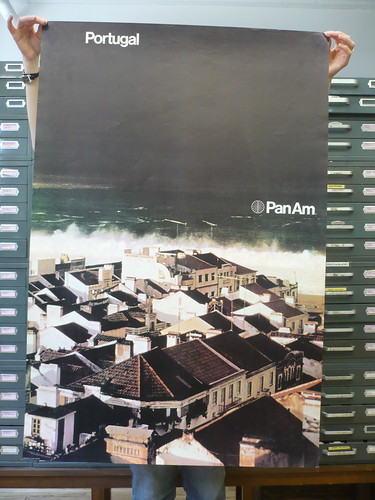
Pan Am designed a variety of publicity for Portugal over the years. The earliest image can easily be identified as Lisboa, even if those famous varinas are no longer selling fish on the banks of the River Tejo. Another interesting find (date unknown) unites a common theme across the Iberian Peninsula: bullfighting. In 1970, Ivan Chermayeff included a photo of Nazaré & its choppy surf for Pan Am. Ah, the First Great Age of Helvetica.
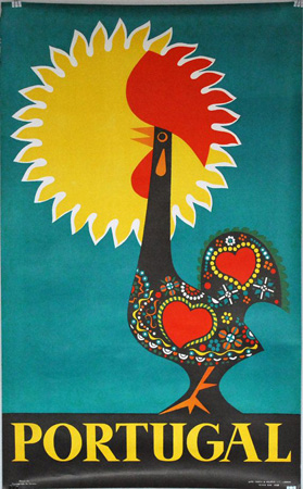
Finally, I love this poster with the rooster & sun combined. No clue about its author or year:
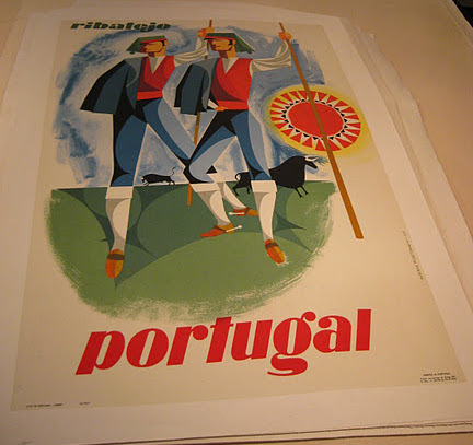
As a tour guide, the most interesting part of looking back at these images is how little Portugal’s PR has changed over several decades. More people than ever are traveling, but images have been slow to evolve. Bullfighting in Portugal is less of an attraction these days, so little use of that imagery exists now. But most everything else is exactly the same… even the traditional outfits of Nazaré. I wonder what new tourism identities Portugal will be able to add in the future!