[Since the hotel we use for the Portugal tour is next to the still undeveloped Parque Mayer (Gehry has since pulled out), I thought it was a good idea to repost these two items. Originally published under the same title on 08 Jan 2008 & 05 Apr 2008.]
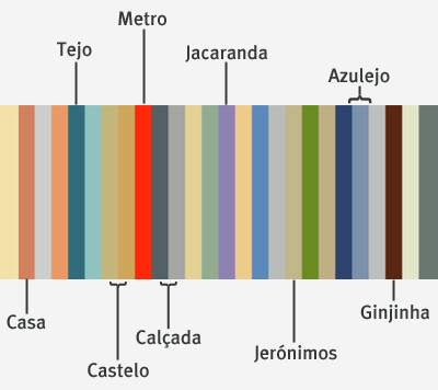
Recommended reading by Brendan, Brand Avenue suggests that cities —even entire nations— have color schemes. It makes sense. One of the things I’ve always loved about Lisboa is its light… a beautiful shade of yellow with just a hint of orange. The Portuguese also have an affinity for pastel tones, painting even public buildings in what I would call Easter colors.
Doing a quick run through some of my Lisboa pix, I came up with the following color palette for that city. It was easy enough… just open Photoshop, copy certain colors, then put them all together. Included for Lisboa are terracotta rooftops, shades of stone from important monuments, the Tejo River, lots of blues from tilework panels & the retro brownish-red of my favorite cherry liqueur, ginjinha. Given that earth tones in general are some of my favorite colors, no wonder I like Lisboa so much. Just in case you need a little more color in your life, visit the Colour Lovers blog. Color in our environment is a lot more important than we normally think.
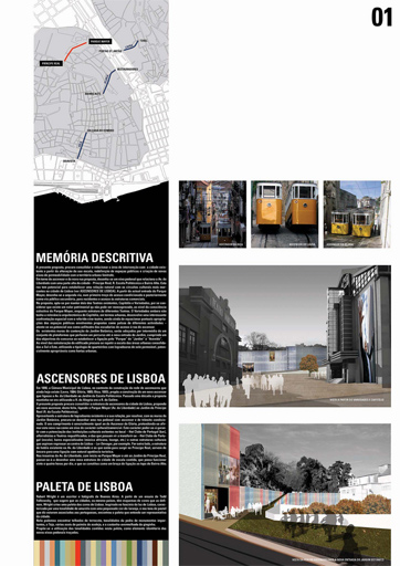
The development of Parque Mayer in Lisboa runs under the guidance of Frank Gehry, but local firms have been invited to participate in many aspects. Ateliermob submitted a project using my Lisboa color palette as part of their design idea. Pretty amazing.

The complete 5-page proposal can be viewed on Issuu… look on the last two pages for my mention. How cool is that? They came in 7th place, but to think that I might have contributed something to one of my favorite cities is wonderful enough.
Nice!
I hadn’t had the time or the inspiration to write in Los Expedientes.
I’m writing in another blog called “men in blog”… un proyecto colectivo de humor en el que mi personaje es una especie de consejero dominical.. you know, kinda like those articles answering doubts on the sunday editions..
About La Ítalo, I been wanting to do a more serious research about it, but hadn’t had the time yet.. but I really want to retake the project. 😛
Hello! I am currently living and doing my study in Lisbon. Past few weeks I was thinking about color palette for my project (I am architecture student, btw) and I have found yours. Hope you don’t mind if I’ll use it mentioning your name, of course.
And wanna add that you are missing that charming green color of entrance doors and painted fences 🙂
Thank you, Rita. Of course you can use the color palette… and yes, the green of entrance doors would be a nice addition! Obrigado!
Hi Robert!
Good job. Where can I find info of the detail of where each color comes from?
Thanks!
Hi Susan – “Doing a quick run through some of my Lisboa pix, I came up with the following color palette for that city. It was easy enough… just open Photoshop, copy certain colors, then put them all together.” Buildings, pavement stones, etc…
Hi Robert! I really appreciate your Lisboa palette. Can I use it in a illustration of mine? I made a sketch of Lisbon some years ago and during the pandemic I’m trying to add digital colors. Bye 😉
Federico (from Italy)
Hello Federico! Of course you can use the palette… I miss Lisboa & can’t wait to return once this is all over. Let me know when you’ve finished. Ciao!
Thank you for this lovely palette, it’s representig the spirit of this beautiful city.