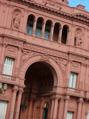
Buenos Aires has its share of iconic buildings & ranking near the top of the list would be the Casa de Gobierno, more popularly known as the Casa Rosada. Let’s just say it: either you like pink or you don’t… not much room for middle ground. In a previous incarnation of this blog, I chronicled the restoration of the building & will have to repost that info later. For now, suffice it to say that the Casa Rosada got a new coat of paint & a lot interior work during Kirchner’s term. For a fascinating & detailed look at the architectural history of the building, Pablo Juan Chiesa has done an amazing amount of research (in Spanish).
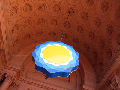
When I first moved to Buenos Aires, tours of the Casa Rosada were few & far between. I always seemed to miss the weekends it was open to the public. But after restoration was complete, the building was open every weekend. My first visit was in March 2009 & I returned this past weekend with Darío. Crowds are a bit of a madhouse now & the tour has changed from two years ago but definitely for the better.
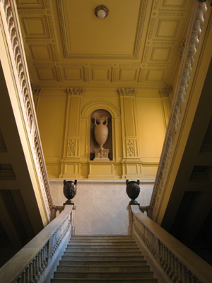
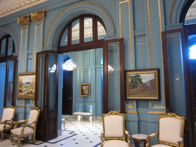
We had to wait 30 minutes for our particular tour to begin, but most of the ground floor was available for wandering. Nicely designed handouts are available in English for non-Spanish speakers, the only language for the tour. First stop, the Salón Azul downstairs to view the Impressionist art collection:
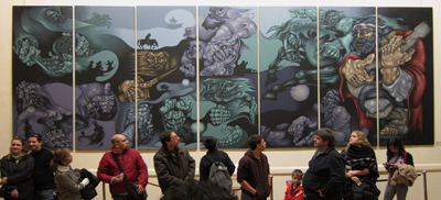
Modern art is present in the Casa Rosada as well, like these panels representing the gaucho tradition:
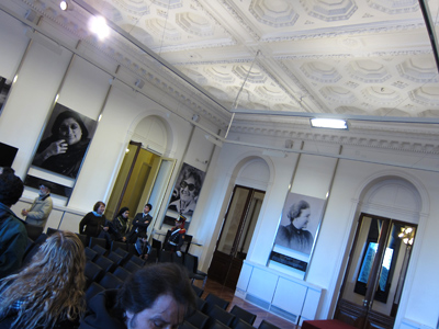
Often used for press conferences, the Salón Mujeres Argentinas is decorated with important female figures in national history. Besides the Madres de Plaza de Mayo & Eva Perón, Tita Merello & Mercedes Sosa could also be found:
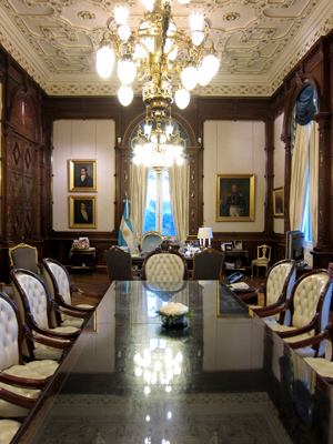
A highlight —not part of the 2009 tour— was the Presidential Office. Formerly the official dining room, Perón turned it into an office in the 1940’s. Absolutely stunning woodwork & a richly decorated ceiling:
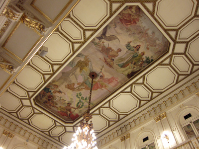
The formal reception room, also known as the Salón Blanco, is probably the most impressive stop on the tour:
But by far my favorite moment —again, not part of the 2009 tour— was stepping out onto the balcony which overlooks Plaza de Mayo. Yeah, that balcony… the one where all the important speeches were given. In such a historical spot, it felt like an incredible privilege to be allowed access. The view is pretty spectacular as well:
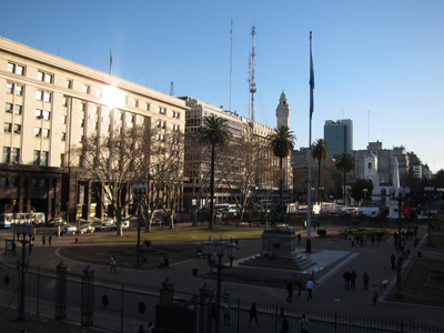
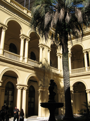
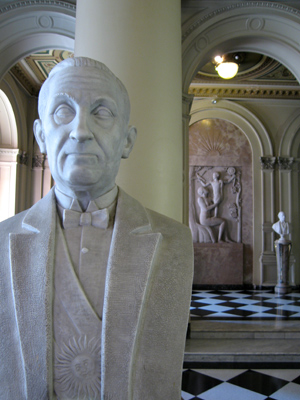
The tour ended back on the ground floor in the Patio de las Palmeras, the only interior patio of the building, & a walk through the Salón de los Bustos. Since President Roca, some of the best Argentine artists have been commissioned to sculpt busts of former presidents. Works can be found by Lucio Correa Morales, Pedro Zonza Briano, & José Fioravanti. Alfonsín joined the rest in 2008, but Kirchner has yet to be added:
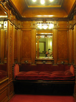
One room I’d hoped to revisit had been removed from the tour: the tiny Presidential bedroom. Since the Casa Rosada was only meant to be an office & not a residence, a small bed was installed for Roque Sáenz Peña… the only President to have ever slept inside. Plush but it doesn’t look too comfy:
In my opinion, the $7 million pesos spent to restore the building for the bicentennial last year were well spent. Imagine the difficulties of adapting such an old & often-altered building to the needs of the 21st century. The Casa Rosada has to be a workspace for the executive branch of government as well as an official reception area & press center. Mixing in modern art & dozens of LED displays certainly helps bring the building up-to-date.
But honestly, there was too much art displayed for the space available… rooms felt cramped because of wall clutter. Also, the displays could have been more uniform. Some paintings had frames, some didn’t, some frames were expensive, others not so much. What a mixed bag. And in some rooms, I got the feeling that someone wanted to cover every wall with something. Whenever Cristina leaves —whether that’s this year or in 2015— the decoration will probably change. But in spite of how artwork is displayed, visiting the Casa Rosada is a wonderful experience & lets the imagination of history buffs like myself run wild.
Isn’t it great that they allow photography inside? Some of the rooms look amazing but I understand this too well: “Also, the displays could have been more uniform. Some paintings had frames, some didn’t, some frames were expensive, others not so much. What a mixed bag. And in some rooms, I got the feeling that someone wanted to cover every wall with something” It rather sums Argentina up, I think.
And from what you wrote, I can imagine the decor is like Cristina herself: too much makeup, too many ruffles and so on 🙂
That’s a great observation, Ana! I’m of the philosophy “less is more” so whenever I see so much clutter, I automatically think “how tacky.” Then again, it fits the current administration well. Nothing subtle about it.
I couldn’t believe we had access to the office & the balcony. That could change at any given time, so everyone should go now while they’re still allowing people to visit. Makes me wonder what they’re doing with Cobos’ office 😉