Recently the city government completed a major project that involved a massive amount of coordination: adopting an official coat-of-arms for each of the 48 barrios in Buenos Aires. Originating from a 1989 decree, a local committee was responsible for the selection of each design based on the following criteria: neighborhood history, ethnic groups, urban planning & prominent activities.
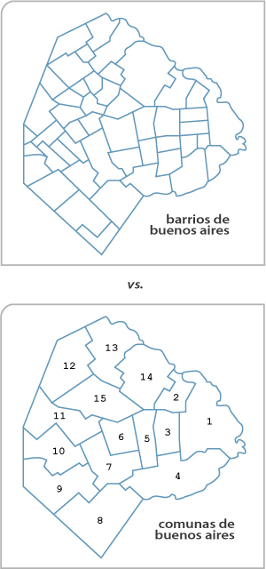
While I think the idea of adopting a symbol to represent each neighborhood is a fantastic idea, the execution failed miserably. For one thing, dealing with 48 barrios is an administrative nightmare & probably why this project took 22 years to finish. That’s another point in favor of dividing the city into 15 comunas with more or less equal population distribution. Naturally people feel an attachment to the barrio where they live & saying “I live in Commune 10” sounds horrible compared to “vivo en Versalles,” but in some ways the individual coat-of-arms seems like a step backward.
However the most horrible part is that the designs are so wildly disparate. Some look professionally done while others look like they were drawn by a 5-year old. Seriously. This is supposed to be official & permanent, right? Doesn’t it make sense to set a few design requirements for everyone to follow?
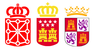
I’m a big fan of vector art, & I remember when all the autonomous communities & government agencies in Spain adopted vector designs. You could argue that it appears a bit commercial —it does— but it helped unify the national image. Vectors can be resized without losing quality, so these designs are placed everywhere from letterheads to flags to road signs. Seemed like a step in the right direction & I think Buenos Aires should have followed their example.
On the other hand, if something more artistic is preferred then why not hire one artist to draw all 48 shields? Ask local neighborhood organizations to pool ideas, come up with symbols that make their barrio unique from all others, then submit the final choices to a single artist. That way, all 48 would have a cohesive, professional look.
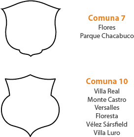
One other idea would be to adopt a particular shield shape for each comuna, then have the interior design different for each barrio. Obviously there are many options… but none were taken.
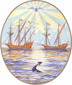
Then again, the idea of 48 different designs isn’t much of a surprise when the city itself can’t seem to settle for a brand. Over several decades, all official correspondence used the old, hand-drawn coat-of-arms. Although a few variations existed, the general idea was two different ships representing the two separate foundations of the city (1536 & 1580), an anchor & a dove:
But when Alfonsín obtained the separation of Buenos Aires from the national government as part of the Pacto de Olivos, almost every administration has changed the city’s logo & often even the color scheme. Insanity. The city will continue to exist —hopefully— regardless of anyone temporarily in charge. There is a need for continuity. And think about the expense of having to redesign each & every sign, letterhead, etc. in the city every four or eight years. Below are examples from the times of Ibarra (2000-06, orange/black), Telerman (2006-07, multicolor) & Macri (2007-present, yellow/black). Note that Macri’s logo conveys absolutely nothing about the city, looking like either prison bars or a barcode. Embarrassing.
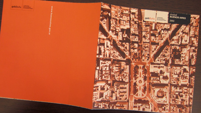
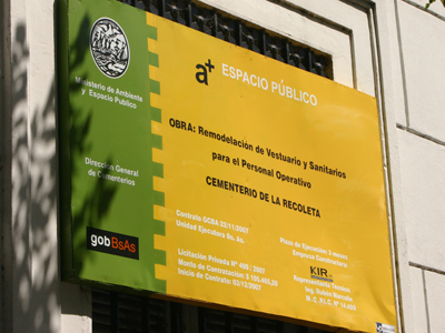
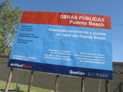
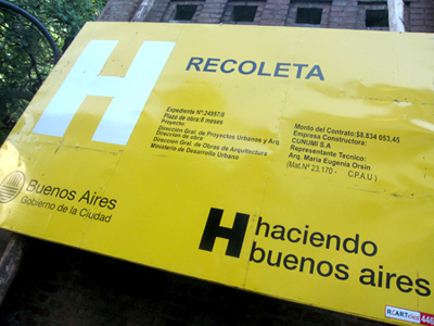
Not to sound like PR rep, but it’s true that effective branding helps establish easy visual recognition & identity… something missing in Buenos Aires. There was a lot of commotion when CFK unveiled the national logo in 2008, mainly because most people did not like the design. But the idea was solid. The logo below appears everywhere these days whether we like it or not. Being the shrewd businessman, Macri should take note & establish a permanent, meaningful city brand.
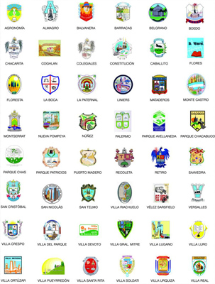
El escudo de La Paternal te lo acepto, qué sé yo, con el trencito y eso, pero ¿el de Devoto? ¿¡Me estás jodiendo!? Sigh.
Besos =)
jajaja Hay varios que más o menos zafan pero Devoto, no. Para nada. Pero como dice Cecilia Oviedo – I’m sorry for you, querida 😉 That’s ok, I still love Villa Devoto. Beso!
El de Flores no podía ser un más feo, ¿no?
Bueh, por lo menos no vivo en Villa Pueyrredón.
ps: Rumor has it that Pro chose the yellow/black combination after BA’s taxis. I owe you an explanation about the shield, “it left us all looking to the southeast”.
jajaja Me gusta el de Caballito. El escudo de Flores parece una mancha de azul con el tren y un librito. Qué horror.
I wonder what the colors will be four years from now 🙂
No sabía que la gente de Puerto Madero aceptara que los pusieran como un “barrio” más de la ciudad… y no sé si “comuna” suena mejor. Quizas preferirian llamarse “arrondissement” como en Paris. ¿Sabías que la gente que vive ahi cuando sale de sus costosos deptos dice “Voy a Buenos Aires”?
Por otro lado, te recomiendo el libro “La otra Buenos Aires”, de Defin Garasa, que recorre barrio por barrio a traves de la literatura, una joyita.
Saludos
jajaja Lo más probable es que dicen “voy a la ciudad” 🙂 Gracias por recomendarme ese libro. Voy a ver si lo consigo en Avda Corrientes. O mejor la version PDF gratis… si existe. Saludos!