Got your pass ready?
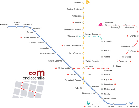
Let’s continue our exploration of the Metro back at the waterfront. A seagull symbolizes the blue line, at one time alternatively named the Linha Gaivota. It is the longest of all four lines with 13.7 km of track & 18 stations. That’s a lot to cover! In my opinion, some of the best Metro tile work can be found here.
Linha azul station names are in bold below, followed by the tile artist & year of installation. Red asterisks (✱) mark my three recommendations for this line. If a station contains more than one artist, all are shown. And remember that a complete list of Metro stations, respective artists & exact locations forms part of the Endless Mile guide Lisbon: Azulejos. Vamos embora!
Santa Apolónia · José Santa Bárbara, 2007
The connecting train station gives a good theme for underground tiles, but placement makes viewing awkward. Bring a zoom lens for a look at details.

●
●
●
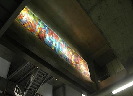
Terreiro do Paço · João Rodrigues Vieira, 2007
Titled “Transparência II”, once again placement seemed to be an afterthought. Since tiles form an integral part of the Metro’s identity, why place important pieces out of sight? (Photo from Câmara Municipal de Lisboa website)
●
●
●
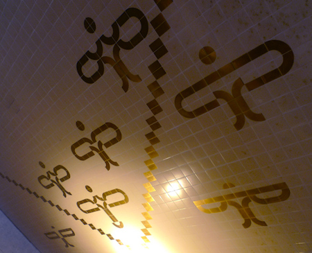
Baixa-Chiado · Ângelo de Sousa, 1998
A predominantly white & uniform station leads to gold, geometric designs at both tunnel entrances. Butterflies? Icarus? You be the judge.
●
●
●
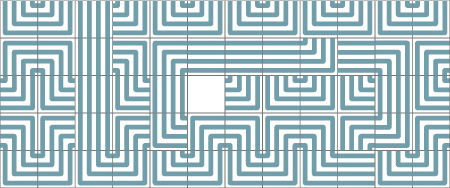
Restauradores · Maria Keil, 1959
Keil builds a labyrinth out of only two tiles with a few accent pieces, reminding me of Theseus & the minotaur. Another fine example of motion.
Restauradores · Luis Ventura, 1994
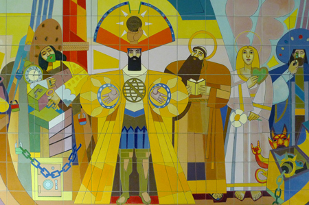
The panel “A Chegança” —in English, simply “Arrival”— commemorates the 500th anniversary of Portugal’s first trip to the Americas. Produced in Brazil, scenes show the encounter of two very different cultures.
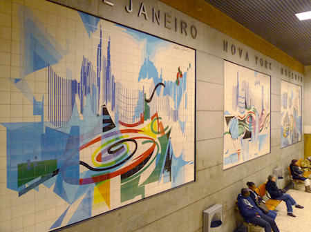
Restauradores · Nadir Afonso, 1995
Afonso began his professional life as an architect, working under great names like Le Corbusier & Oscar Niemeyer. He helped bring Kinetic Art to Portugal, & these panels of major cities showcase his energetic style inside one of Lisbon’s busiest stations.
●
●
●
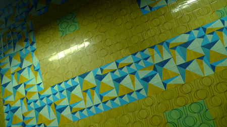
Avenida · Rogério Ribeiro, 1959
Invited by Maria Keil to decorate part of this station, Ribeiro used geometric patterns as she would have but added a bit more color.
●
●
●
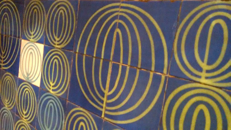
Marquês de Pombal · Maria Keil, 1959
Due to its central location, this station has undergone a lot of change since it first opened. Sculptures by João Cutileiro decorate the modern part of the blue line, but a few original tiles by Keil remain (photo from Wikipedia).
●
●
●
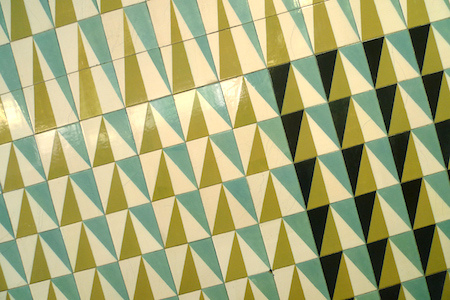
✱ Parque · Maria Keil, 1959
These geometric patterns are some of my favorite by Keil. Both the shape & color palette capture the 1950s well.
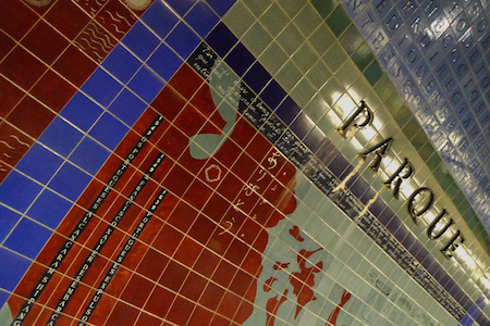
✱ Parque · Françoise Schein & Federica Matta, 1994
As part of the station’s renovation, Schein & Matta were invited to provide new art work. Fantastic job! Portuguese discoveries are tied in with human rights issues, & quotes from Fernando Pessoa allow for even more introspection. Get out here & walk around to see it all.
●
●
●
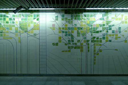
✱ São Sebastião · Maria Keil, 2009
When Metro authorities extended the red line to this station, they invited Maria Keil back. This seems to be her last major work before passing away in 2012. Ridged ceiling tiles show mathematical progression while whimsical trees with a few random birds can be found in hallways.
●
●
●
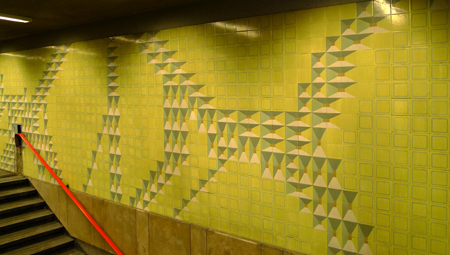
Praça de Espanha · Maria Keil, 1959
This pattern updates the ponte da diamonte (diamond point) design, popular in the 1600s. Again, a very 1950s color palette.
●
●
●
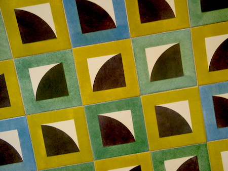
Jardim Zoológico · Maria Keil, 1959
Probably my least favorite design by Keil but still innovative for the time.
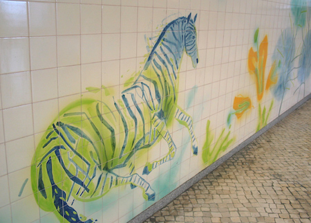
Jardim Zoológico · Júlio Resende, 1995
Since the station connects to the local zoo, Resende brought his freehand, watercolor style to tile work. Large scale animals & plants give zoo-goers a preview.
●
●
●
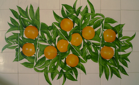
Laranjeiras · Rolando Sá Nogueira, 1988
The Portuguese word for “orange tree” is laranjeira, so Sá Nogueira took this station’s name literally & designed Pop Art, fruit-filled panels.
●
●
●
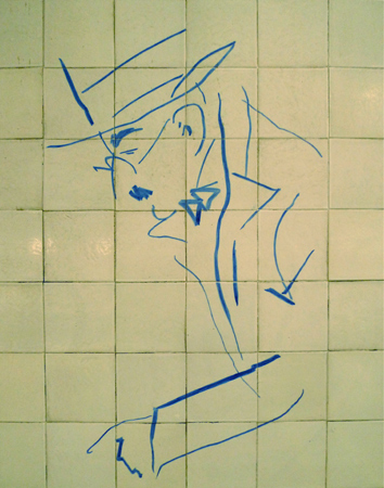
Alto dos Moinhos · Júlio Pomar, 1988
Pomar sketched four great Portuguese poets —Fernando Pessoa, Luís de Camões, Manuel Maria Barbosa du Bocage & José de Almada Negreiros— in everyday scenes. Pessoa takes center stage, though, with his easy-to-recognize chapeau & round frame spectacles.
●
●
●
✱ Colégio Militar/Luz · Manuel Cargaleiro, 1988
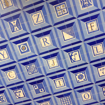
Without question, one of my favorite stations. Cargaleiro revived the ponte da diamonte design like Keil did above; however, he stuck to a more traditional palette & inserted letters in the center of most tiles. Lots of fun.
●
●
●
Carnide · José de Guimarães, 1997
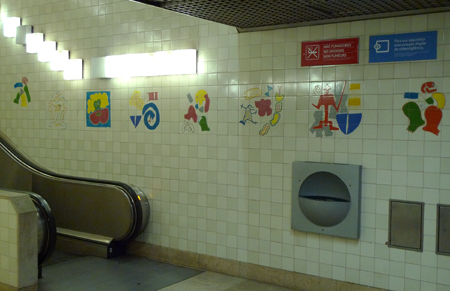
Primary colors & simple designs reflect the artist’s stay in Africa in the 1960s. Some panels seem overtly sexual for the Metro, but judge for yourself!
●
●
●
Pontinha · Jacinto Luís, 1997
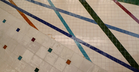
Solid colors with elementary shapes allow different parts of this large station to blend together nicely.
Remember that the following stations are outside of the 24-hour pass zone. You can go to each station, but the card will not allow you to exit. Continue to the end, cross to the opposite platform & head back into town after you’re done.
●
●
●
Alfornelos · Ana Vidigal, 2004
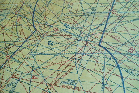
Vidigal chose fashion design to mimic the urban grid… fabric patterns seem identical to a big city’s transportation network.
●
●
●
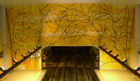
Amadora Este · Graça Morais, 2004
Grape leaves & vines hint of an earlier time, when this part of Lisboa was agricultural instead of urban.
●
●
●
Reboleira · Leopoldo Rosa, 2016
This station went over budget & suffered constant delays. Perhaps that’s why no invited artist participated. Sure, tiles can be found but are more functional than artistic… exactly what Maria Keil tried to avoid!
Lisbon Metro, tile series: Basics • Linha verde • Linha azul • Linha amarela • Linha vermelho
